
CONTEXT
OVERVIEW
LinkPals: A platform to find study buddies and form friendships outside of the classroom.
LinkPal was designed in a team of three in a course called HCDE 318 (User-Centered Design). My team designed a platform that provides ways for high school and university students to find people to study with, as well as maintain these connections even outside the classroom. Here is the link to our final prototype.
MY ROLE
User research
Usability testing
User centered design
TEAM
Ha Tien Ngyuen
Kelly Tong
Maia (me!)
DURATION
10 weeks
TOOLS
Figma
Miro
Pen and paper
BACKGROUND
Students struggle to reach out to their peers when seeking help.
Studying for an exam or struggling with completing homework are issues that all students have dealt with. It can be difficult for some, especially introverted students, to reach out to their classmates outside of a school setting. Maintaining relationships with study members can be just as important as finding people to study with for many students.
PROBLEM STATEMENT
How might we encourage students to find study partners while also preserving friendships beyond the classroom?
USER RESEARCH
CONDUCTING INTERVIEWS
Our team conducted a total of 6 interviews with students of different years in high school and college and different majors. We approached students of various ages/grade levels and those who have differing interests in what they are studying or hope to study.

KEY INSIGHTS
After finishing our interviews, we analyzed and highlighted the overarching trends and patterns between their responses that explained their motivations and pain points for finding people to study with.
01
School platforms are intimidating
Students find it intimidating to reach out to their peers using school affiliated platforms (Slack, PIazza, Canvas).
02
Online connections are preferable
Students have an easier time making connections and initiating the first conversation online rather than in person; typically through social media platforms.
03
Similar understanding of material
Students find it easier to study with those who are already at a similar level of understanding to the class material to them.
04
Similar interests and hobbies
Students find that they have a more positive and smooth experience studying with people who have similar interests and hobbies outside of class.
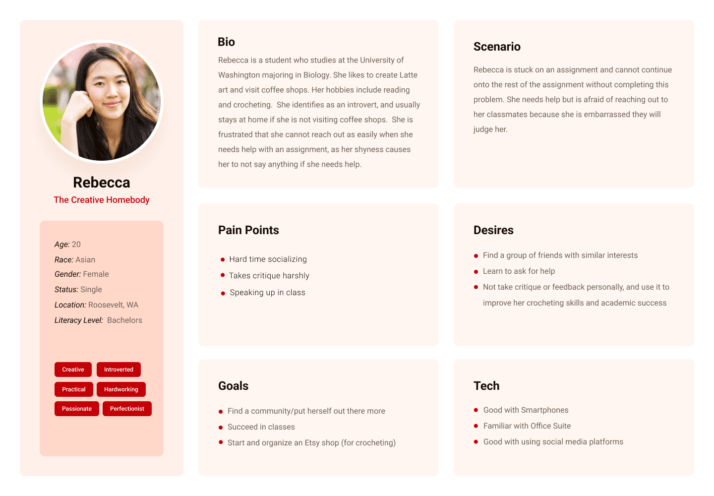
USER PERSONAS
Using the information we gathered from our interview responses and key insights, we identified common characteristics and a distinct user for our app. The following persona is a representation of the target users of our app.
IDEATION
USER JOURNEY MAP
As the first step in the ideation process, I created a journey map summarizing the steps and actions a user must take when finding someone to study with. Additionally, the map takes note of their thoughts throughout the process.

STORYBOARDING
The last step in our ideation process was to create storyboards as a way to visually illustrate how different users would interact with our product. Below is a scenario of how I imagined users using our app.
Scenario: a student who wishes to find a group of people to study with who share similar hobbies and interests

COMPETITIVE ANALYSIS
Looking at other applications with the same goal of connecting students with an emphasis on studying gave an insight into what features are important to users. Competitors lack a friendly environment for students to feel comfortable in reaching out to each other. Students should have the autonomy to create their own group chats and study groups without moderation from the school.
Slack
Discord
StudyBunny
KiwiLink
Connect with other students
✅
✅
❌
✅
Autonomy
✅
✅
✅
✅
Motivation factor
❌
❌
✅
❌
Organization
✅
✅
❌
❌
WIREFRAMING + PROTOTYPING
INFORMATION ARCHITECTURE
Before designing our app, we used the information we gathered to create an information architecture. This outlined the key pages and sections to be featured in our app and how to organize them.

INITIAL WIREFRAMES
Once we determined the main pages and sections of the app, we created low fidelity wireframes in Figma. Our primary focus was to include the key features that would be implemented in the app. We then moved on to add some additional details to the initial designs.


USABILITY TESTING
After completing our initial designs, we turned to potential users to conduct usability tests. Our team developed an evaluation plan that included three tasks that we thought were critical to the purpose of the app. The testing was conducted in a semi-structured manner to gain insight into positive aspects, pain points, and recommendations for improvement before moving on to the creation of our high-fidelity prototype.
FINAL DESIGNS + REFLECTION
ITERATIONS
Using the feedback we received from the usability testing, we made adjustments accordingly to enhance the user experience.
More streamlined home page
We changed the organization of the home page to prioritize the study groups over specific user suggestions.
We emphasized displaying more information on the suggested groups over the groups the user is already in, as they would already know general information about their groups.
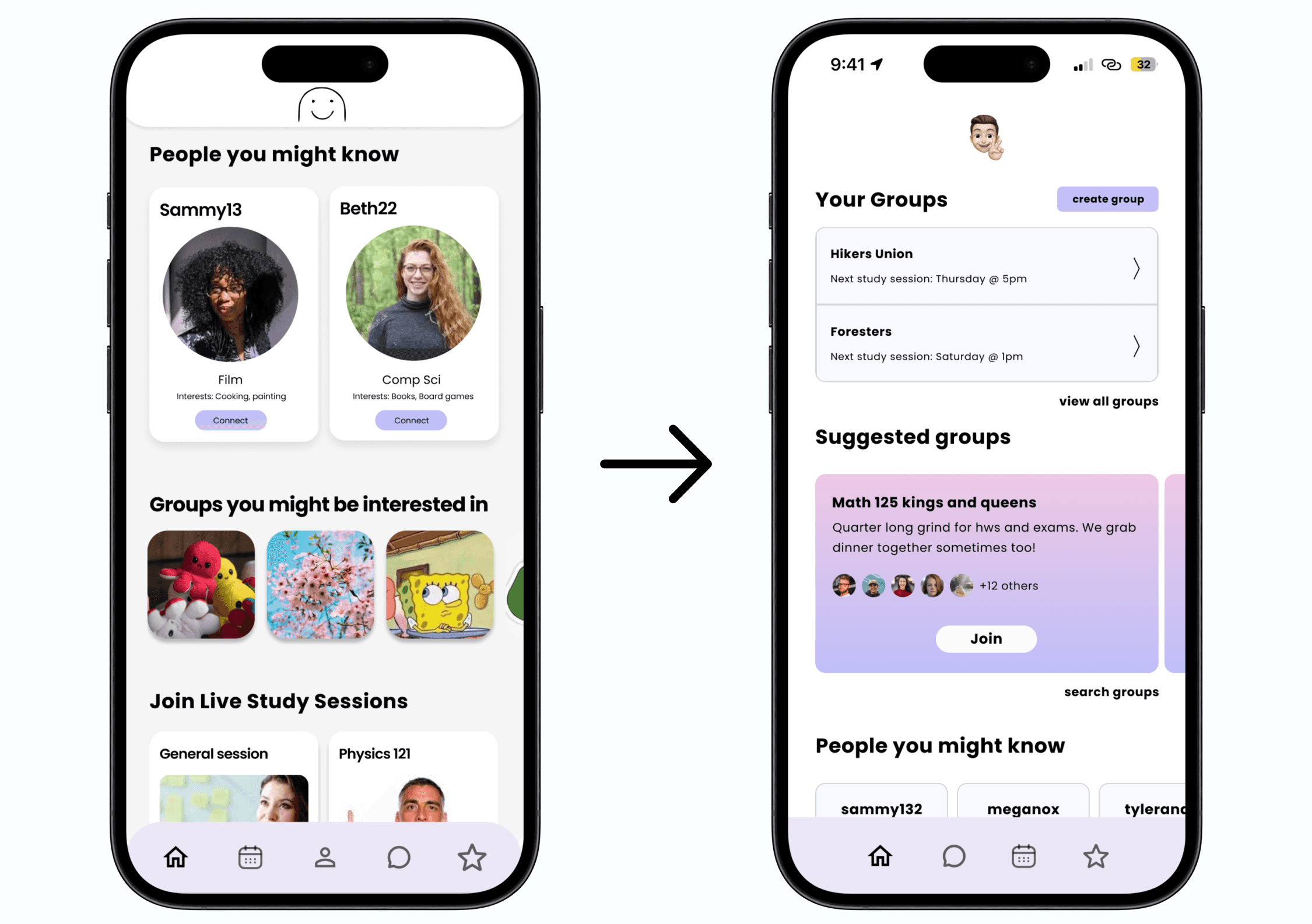

Creating and searching for groups
Our original designs did not have a way for users to create their own groups. This is important for people who seek a specific group of people to work with that has not already been created.
We also made a search groups feature to help minimize duplicate groups.
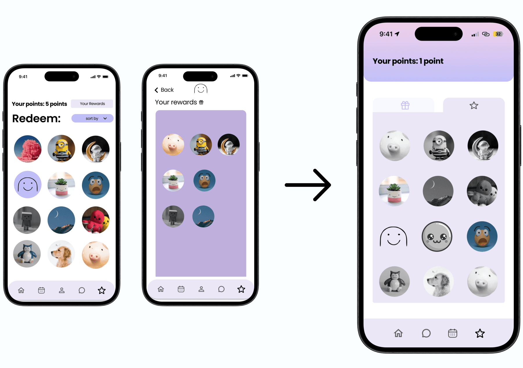
Consolidate rewards to one page
Consolidating both pages to one screen and separating them through tabs and black and white makes the differences between the collected and uncollected rewards more clear.
Previously, our designs had the users' rewards and the rewards store be in two separate pages, but we found that this was confusing and unnecessary.
FINAL DESIGNS
On top of using user feedback to make some major design changes, we also focused on creating the branding for our app, which involved selecting a color palette, typography, and overall aesthetics. By putting emphasis these different aspects, we ensured that the design of our app not only met the functional requirements but also delivered an engaging and visually appealing user experience. Here is the link to our final prototype.


REFLECTION
This was my first project where I was able to go through the entire user centered design process. I learned the importance of each step in the process and how they build off of each other to ensure creating a product with a meaningful user experience. I also learned how to use Figma more in depth, such as using auto layout and creating and using components.
Users provide the most useful feedback.
In one of my classes, I had learned that while empathy is an important trait in a designer, no amount of empathy can replace the experiences of the users themselves. This was proven when we were conducting the usability tests, as there were many aspects of the user experience that we had not considered that would be important to the target users.
Every step in the process holds equal importance.
In previous projects, I had focused mainly on the design of the final product. However, completing this project over a longer period of time made me realize how important each step is. Communicating with potential users through interviews and usability testing to implement their feedback is just as important going through multiple design iterations.
PREVIOUS PROJECT
NEXT PROJECT